
Quadrant Visual
Explore the relationship between metrics and conduct four quadrant analysis.
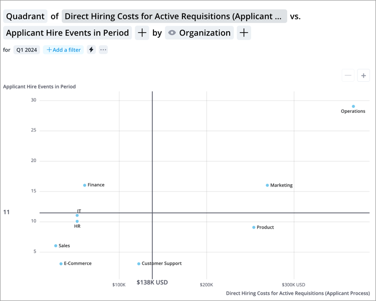
The Quadrant visual is a scatter plot divided into four quadrants to form a 2x2 matrix. Each item on the visual represents a group. Use this visual to see how individual groups are classified into four categories (four quadrant analysis), find common attributes between groups, and identify outliers in the data. This visual supports up to three metrics. By adding a third metric, the data points are replaced with bubbles and an additional dimension of the data is added. The size of the bubble reflects the magnitude of the third metric value, so you can easily identify the differences between groups.
Note: The maximum number of data items that can be displayed is 3000.
How to explore the visual to gain insight
- Divide the scatter plot into four quadrants by setting the values where the vertical and horizontal lines will appear:
- Click the Compare to button
 on the Visual Actions menu.
 - In the Compare to panel, select the reference line you want to edit. The vertical line is determined by the value of the primary metric and the horizontal line is determined by the threshold of the secondary metric.
Tip: To create four equal quadrants, click the Center on thresholds toggle button under Quadrants.
- Enter the metric value for where you want the reference line to appear in the Value box and then click Apply.
- Click the Compare to button
- Identify the attributes that the groups in each quadrant share. For example, you are looking at the Quadrant of Direct Hiring Costs vs Hire Events grouped by Organization Hierarchy to determine which organizations have the most costly hiring process. You will have the following quadrants:
- High direct hiring costs and high hiring events.
- Low direct hiring costs and high hiring events.
- Low direct hiring costs and low hiring events.
- High direct hiring costs and low hiring events.Note: In this situation the group with high hiring costs and a low number of hiring events is the group of interest as they are contributing the most to the overall cost of hiring.
- Label the four quadrants to provide additional context for the audience:
- In the Compare to panel under Quadrants, click the Edit button
 on the quadrant you want to label.
 - Enter a label for the quadrant.
Note: The maximum quadrant label length is 48 characters.
- In the Compare to panel under Quadrants, click the Edit button
- Highlight the different quadrants by adding background colors:
- In the Compare to panel under Quadrants, click the Highlight quadrants toggle button.
- Select the background color for the quadrant by clicking the Change color button
 .
.
- Having identified a group or groups of interest you can move on to conduct deeper analysis of why this situation exists.
- Add a third dimension to the chart by clicking the Add a metric button
 in the visual title.
Tip:
- The quadrant labels appear in the following order: top left, top right, bottom left, and bottom right.
-
Right-click on a chart item or data point to open the Visual Item Actions menu. Find actions that will allow you to quickly interact with points of interest. Actions include drilling up or down to view different levels of your data and accessing the Detailed View visual to see a list of subject members or event occurrences that make up a given population.
-
In order for employee photos to appear in the visual the following criteria must be met:
- Your organization has uploaded employee photos
- The visual contains two metrics and a group by
- The visual is grouped by Full Name
- The visual contains 30 data points or less
-
To hide employee photos, click Settings
 on the Visual Actions menu, and then turn off the Show employee photos toggle.